Bài giảng dưới đây là một phần trong sách Ielts Writing Task 1 by Dương Vũ, combo sách tự học Ielts 7.0 – 8.0, click here

Kinh nghiệm viết luân Ielts WRITING 8.0: https://idvielts.com/kinh-nghiem-viet-luan-ielts-band-8/
Khóa học Ielts Chuyên Sâu 6.5 – 8.0: https://idvielts.com/category/khaigiang/
Hướng dẫn chung viết dạng Line Graph:
- LINE GRAPH luôn là dạng động nên cần nắm vững ngôn ngữ về xu hướng trong Slide bài giảng kèm sách: tăng, giảm, mức độ, gấp bao nhiêu lần, lập đỉnh, chạm đáy…
- Đề có nhiều biểu đồ hay nhiều đường, chỉ cần phân tích xu hướng chung từ đầu đến cuối
- Luôn gộp các đường gần nhau (cùng 1 level) hoặc giống trend để đỡ phân tích lặp
- Xếp hạng các đường, và nhìn điểm đầu/ cuối để viết overview: đường nào cao hơn, cái nào tăng, cái nào giảm
- Gộp các giai đoạn lớn, không nên phân tích chi tiêt từng mốc thời gian trừ khi đề ít dữ liệu. Các bạn có thể đánh số các key features cần phân tích như dưới:
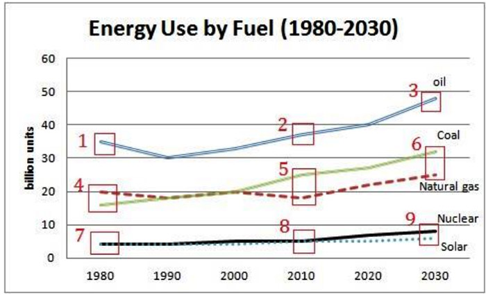
LINE GRAPH ENERGY SOURCE IN AUSTRALIA
The line graph presents the quantity of energy consumed in Australia from 1980 to 2030, by five different energy sources. Overall, there was an upward trend in consumption of all types of energy except natural gas during the first 30 years, and the use of all forms are projected to rise by 2030.
More specifically, oil has remained the largest source of energy, with around 35 billion and 38 billion units being used in 1980 and 2010 respectively. Its consumption is estimated to reach approximately 48 billion units in 2030.
Coal and natural gas are also major sources of power. In 1980, around 16 billion units from coal were consumed and the quantity of natural gas was slightly higher. Ten years later, however, the first rose to roughly 25 billion units, overtaking the latter. By 2030, coal consumption is predicted to reach over 32 billion units and will still be significantly larger than that of natural gas.
The amounts of nuclear and solar power used were similar and stayed at the same level for the first 30 years, at about 4 billion units. These sources are forecast to experience a marginal rise by 2030, reaching around 8 billion and 6 billion units respectively.
LINE GRAPH AUSTRALIA EXPORTS (thân bài chia 2 nhóm đối tượng: tăng + giảm hoặc cao + thấp)
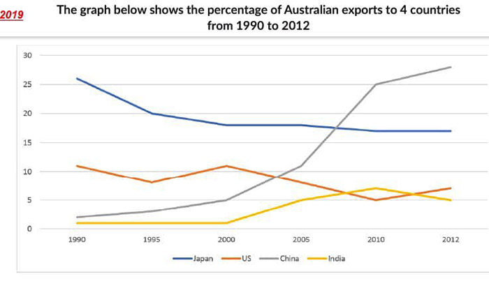
The chart shows changes in the proportions of Australian exports to Japan, the United State, China and India between 1990 and 2012.
It is clear that the shares of Australian exports to Japan and the US were on the decline over the period shown whereas an overall upward trend can be seen in the figures for China and India. In addition, China had replaced Japan to become Australia’s most significant export market by 2012.
More specifically, Japan accounted for the largest proportion of Australian exports in 1990 (over 25%), and this was nearly 13 times larger than the share of China. By 2012, however, the percentage of Japan decreased steadily to around 17% while that of China rose persistently and reached approximately 28% in 2012, making it the largest importer of Australia that year. (nhóm 2 nước lớn – năm cuối)
With regard to the remaining markets, the shares of the US and India fluctuated between 1990 and 2000 around 10% and 1% respectively. The first then halved whereas the latter climbed to roughly 7% in 2010. By 2012, however, the figure for the US bounced back while India saw a marginal decrease and remained the least significant among the four markets. (nhóm 2 nước có số liệu thấp hơn – năm cuối)
LINE GRAPH CHINA OIL (lưu ý đơn vị per day chứ không phải per year để chèn số liệu chính xác)
(Bài ít dữ liệu phân tích cả điểm đầu, cuối + mọi điểm gẫy gập, gộp các giai đoạn có trend giống hay đối lập nhau, thân bài chia 2 giai đoạn lớn dựa vào điểm giao cắt nhau)
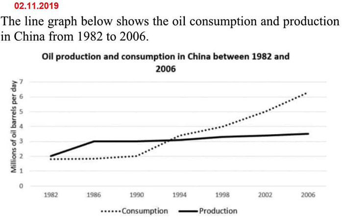
The graph shows data about the production and consumption of oil in China between 1982 and 2006.
It is clear that an overall upward trend can be seen in the amounts of oil consumed and produced daily by the country over the period shown. Noticeably, the first increased at a significantly faster rate than the latter.
In 1982, the output of oil production and the amount of oil used in China each day were at the same level (around 2 million barrels). Over the next 12 years, the figure for production rose to 3 million barrels and then plateaued while the level of consumption remained almost unchanged before experiencing a surge in 1990. By 1994, China’s daily consumption of oil surpassed its production capacity.
Over the following 12 years, the amount of oil consumed by the country on a daily basis had more than doubled, reaching over 6 million barrels in the final year. Meanwhile, there was just a slight increase in its domestic oil supply, with around 3.5 million barrels being made per day in 2006. (mệnh đề V-ing)
LINE GRAPH CINEMA VISIT IN UK BY AGE (thân bài chia 2 nhóm đối tượng: cao + thấp)
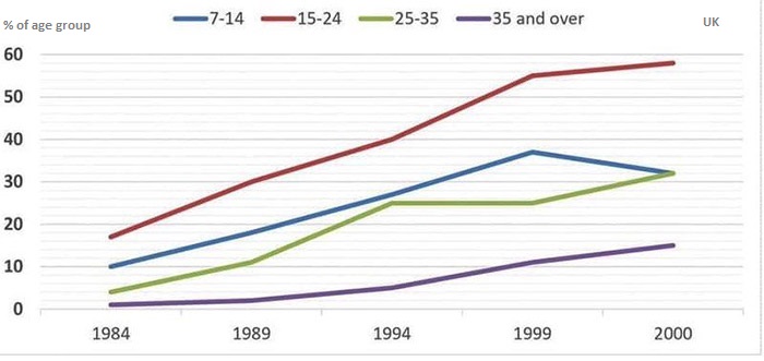
The proportion of people in the UK who went to the cinema at least once per month (1984- 2000)
(Ngôn ngữ nhóm tuổi – age group bạn xem trong SLIDE BÀI GIẢNG kèm sách)
The chart compares the percentages of population going to the cinema at least once a month in the UK between 1984 and 2000. The data are categorized into 4 different age groups.
It is clear that the proportions of cinemagoers in all age brackets were on the rise over the period shown. In addition, going to the cinema was most popular among 15-to-24-year-olds and was least favoured by those aged 35 and over throughout the years.
In 1984, the percentage of young people aged 15 to 24 visiting the cinema at least once per month was around 18%, and this was nearly twice as large as that of 7-to-14-year-olds. The first then rose persistently and peaked at roughly 60% in 2000 while the latter reached a high of over 37% in 1999 before dropping to around 31% in the final year.
With regard to the two older age brackets, less than 5% of each group went to the cinema at least once a month in 1984. By 2000, the proportion of cinemagoers aged between 25 and 35 reached the same level as that of the 15-to-24 group, and this was more than double the figure for the oldest group (15%).
LINE GRAPH RICE EXPORT THAILAND VIETNAM (mục đích của bài là so sánh 2 nước theo năm, đề này đặc biệt xếp năm ở hàng dọc nên nhìn độ cao thấp các đường mới ra xu hướng)
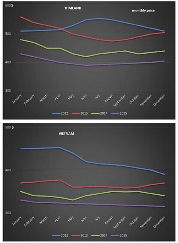
(đề nhiều dữ liệu chỉ mô tả chung mỗi đường, gộp 4 năm thành 2 giai đoạn lớn, lưu ý nhắc đến dữ liệu month)
The graphs show changes in monthly price of rice exports from Thailand and Vietnam between 2012 and 2015.
It is clear that the price of rice exported by both countries declined over the period shown. In addition, Thai rice was traded at a far higher price than Vietnam’s in all 4 years.
In 2012, Thai exports of rice varied between roughly 500$ and 550$ per tonne with the highest figure being recorded in July. Price of Vietnamese rice, however, fell steadily from around 450$ a tonne at the beginning of the year to under 400$ by December. By 2013, Thai rice saw its lowest price in August, at roughly 470$ per tonne, while its counterpart fluctuated around 360$ only.
Over the following two years, the price of Thai rice fell from a high of over 460$ per tonne in January 2014 to slightly under 400$ in June 2015, its lowest point in 4 years. Similarly, exported rice of Vietnam also experienced a significant drop from


Khóa học Ielts Writing Band 7 – Band 8: https://idvielts.com/category/courses/


Chào cô , e cần mua bộ sách tự học Ielts 4 kĩ năng của cô ạ, rất mong nhận được sự phản hồi sớm từ cô .cảm ơn cô
Chao em, em nhắn vào email duongvuthu@gmail.com giup co nha