The pie chart gives information about the country of birth of people living in Australia and the table shows where people born in these countries live. Write a report by selecting key features and make comparisons when relevant.
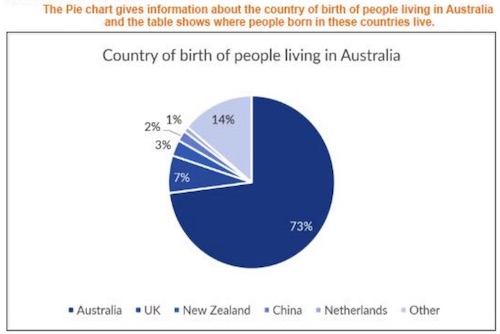
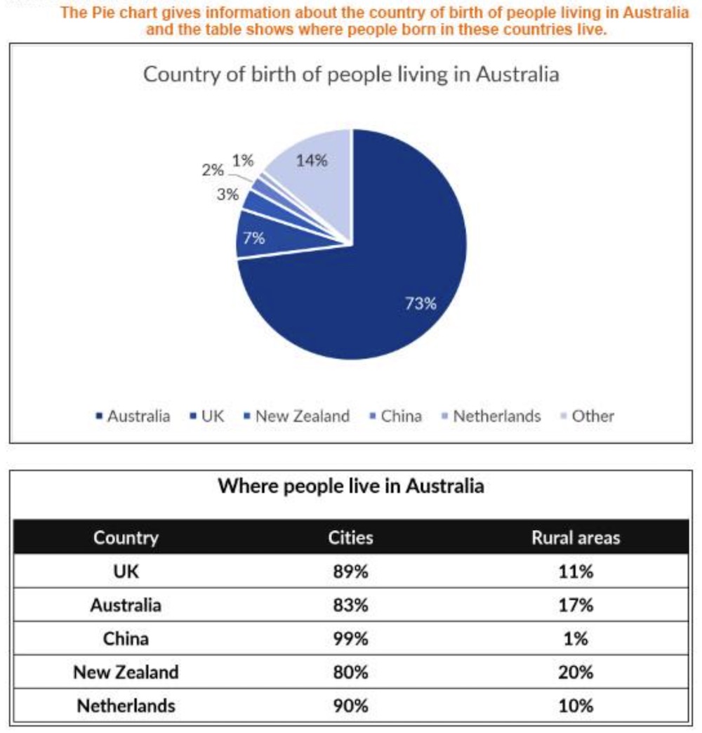
The pie chart compares the proportion of Australian people by their country of origin and the table presents data about their residential areas in Australia.
It is clear that the majority of people living in Australia are native Australians or come from the UK. In addition, most Australians, especially those coming from China and the Netherlands, prefer living in the city.
Specifically, native Australians account for nearly three quarters of the country’s population. The second most common country of origin in Australia is the UK (7%), followed by New Zealand (3%). By contrast, Chinese people only represent a negligible proportion (1%) and the rest is made up of immigrants coming from other countries.
With regard to their living area, the overwhelming majority of Chinese immigrants are living in cities (99%), compared to 90% of those from the Netherlands and 89% of those from the UK. People coming from New Zealand prefer living in the countryside the most, with one fifth of them residing in rural areas of Australia. Up to 17% of native Australians are also living in the countryside. (180 words)
Bộ Sách Ielts Writing 8.0 Task 1 + 2 by Dương Vũ 8.0 WRITING bao gồm SÁCH HƯỚNG DẪN CHI TIẾT CÁCH LÀM + 200 SAMPLES + VIDEO BÀI GIẢNG + LỘ TRÌNH HỌC gồm tất cả những gì bạn cần để học tốt writing nên tương đương với 1 khóa học Ielts Writing 15 tuần mà chi phí rât khiêm tốn. Rất nhiều bạn tốn cả chục triệu đồng thi lại Ielts vì không học đúng tài liệu chuẩn, thực sự lãng phí cả tiền bạc, thời gian và cơ hội: https://idvielts.com/sach-ielts-writing-by-duong-vu/


